Statement of intent
My aim is to create a Portfolio of work which shows my ideas and development of my creative work which reflects the theme of my project which is portrait photography. At the end of every shoot I will chose my best and worst photographs and put them in a gallery.
Initial research
In my research I have been looking at photoghraphers which use masks in there work, so at this moment I think I would like to do work like this. I have one person in mind who is Caryn Drexl, the reason I have chosen her is that her images are fun and scary thing and amazing art. She makes me see the dark side of things that are rather beautiful if you look at it from another angle and to take somthing not so good and make it look amazing. My second person is a man called Jourden who uses the anonymous mask and then puts writing beneath which tells the gods honest truth about how there will never be peace.
Choosing my theme
I am choosing my theme from one of my all time favorite band slipnot because I see that there many ways to my work but also I think my work shows something scary but then can become something beautiful and I know for certain I want to do this theme because I like seeing changes to thing but never to me and I think that is why I like doing this work
Showing progress
I am going to show progress by taking screen shots of my work as it progresses and then put them on my page and updated images like my best and worst. I will also experiment with Photoshop to refine my images and help me to learn how to use different filters, techniques as my work progresses.
How I am going to experiment
I am going to take some pictures with a boy and some with a girl wearing a mask and I am going to use studio lights and reflectors and some different back drops. I can change locations to outside and I am going to use new ideas and more light back drops and use objects to make my images look better. I will then experiment in Photoshop, using different filters, layers, graphic pen, opacity, contrast, black & white and saturation.
Time line
My time line is 2-3 moths so I have long enough time to make sure I get all my shots done and perfect
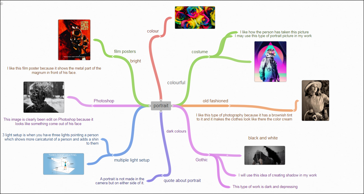
Quote about portait
"A portrait is not made in the camera but on either side of it."
This is my coogle mind map
Mock exam
Context
In image number one we can see a sortove plant with pespole petals casting a shadow onto the womens face she is visibly in the light. The sweet spot is her eyes the flowers have been blurred using Photoshop a medium depth of field has been used as the shadow from the branch stretches a cross her face to make it look like a sorture Japanise wallpaper effect under her eye. Because the plant looks like a blossom branch.
Composition
I think in image one for the foreground is of distance because it is up close with the women's face there are leading lines, and it goes straight across the face given the blossom branch a sort of modern slick look to it. The photographer has used the rule of thirds and the sweet spot is her eye. The view on the women's face and eye sort of makes you see what she is seeing.
In my personal opinion the f-stop is that they have used a small f-stop as you still get the brightness of the sun . But you can still see the shadow and doing that woth 6400 would l
The white balance I think they have used is day light. Because it is bright but you still getting colours and the shadows. In the image I think it is perfectly exposed. I think the photographer did use a camera stand even if it took
Yes I think that the image has been altered a bit using photo shop by using the blur tool on the blossom plant,
The main colours in the image are pink , ginger, purple, blue , green and turquois. There is only one pattern on the image which is being created by the shadow of the blossom plant .
The image has not been cropped because the photographer would have struggled to keep the plant into view but if he didn't crop it he would have to get close and hold the flower whilst taking the picture.
There is only one thing in the image that the photographer has use with is the blossom plant.
Connection
I like the work of this photographer because he has taken close ups of peoples faces so you can see every feature and he has used basic materials for extra looks in his or her work.
Describing their work in detail I would say he has used a young women with a blossom plant fading the sun to take his picture which works excellently
Describing their work in detail I would say he has used a young women with a blossom plant fading the sun to take his picture which works excellently
Photography research
Context
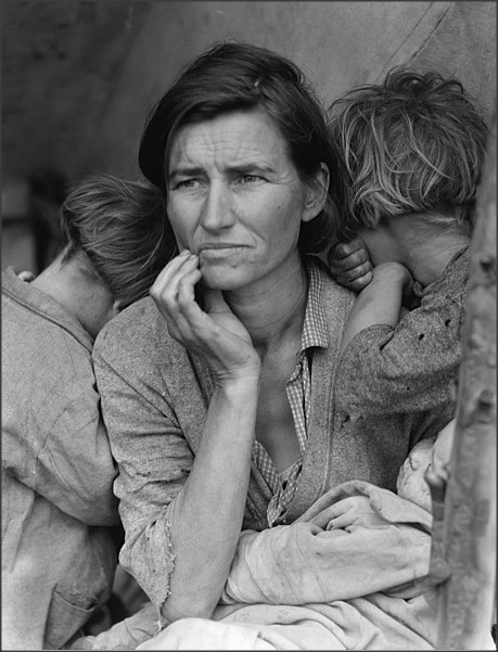
This image was taken in 1936 while employed by the U.S. government’s Farm Security Administration and was in the Great Depression to raise awareness of and provide aid to impoverished farmers
Composition
This is a women that has three kids she is in the sweet spot the image is in black and white she looks worried that she cant take care of her kids. The photographer has took this picture at eye level this shows the womans pain the black and white makes her look sad and depressed the image looks very bleached and rustic.This image does not allow me to feel anything for her because I don't know what has happen to her. When you look in to her eyes she has a glimpse of regret so I don't think I will be using this style in my work. I think it is hard for me to see what shes felling. I think it would look better in colour because you would be able to see her pain and that to me would help me feel more emotions towards her and with colour I would feel all round sorry for her and what it looks like she has lost her house and her money and she looks like a single mum with three kids and I think anyone can feel her pain because she is sad and lonely and trying to provide for her family . The image is effective by it being at a eye level which makes it feel like how it would feel to be in her place
Connection
The theme of this image is portrait this is the theme I will be doing this year
the reason the image is related to my work is that we are doing portraits for this project.
I believe that there is a message in the image that you should give help to the people less fortunate to you
and that there are people struggling int the world and we should help in anyway we can.
The effect of this images is to show the struggle of being a parent with very little money and being alone.
The colour black and white is good for this image. However I may not use this style in my work depending on what type of portrait photography I decide to do.
Comment
I think that the image looks smart because black and white makes the facial expressions stand out and it shows her pain what I dislike about the image is it is not in colour. But I think the photographer could have only been able to use a film camera as that was what was available in them days. If it was in colour I feel you could get more understanding of the image.
This image does inspire me in a way because you can use the film camera for a Gothic type of portrait which I like because the Gothic photography makes more sense because the black and white is Grime which goes well with the Gothic portrait photography.
I think that the photographer took the image like this because they wanted to take a image that shows the struggle of a single mother.
Magdiel Lopez
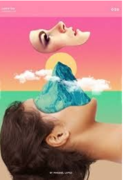
Born in Havana Cuba, Magdiel Lopez spent his childhood years inspired by the colorful culture that surrounded him. Naturally, such upbringing played an integral part in forming Lopez’s keen sense of style, art and design, which can be realized in his works today.Looking for freedom and a better life, Lopez moved to the United States at fifteen, where he continued working on his skill for the next 10 years privately.
Lopez decided to reveal his work in a series called “A Poster A Day” — releasing one piece of artwork on his Instagram everyday for 365 days. Each day garnered more attention from a global audience, ultimately leading Lopez to be featured by the New York Times, Cosmopolitan, Entrepreneur, and Awwwards.
To date, Lopez has worked with several brands such as Apple, Nike, Absolute Vodka, MTV, Warner Brothers, etc., and currently has a partnership with Adobe as a design mentor and creative”. Sourced from the internet: https://magdiellop.com/about
CompositionThe rule of thirds has been used in this image as the women face is in the top part of the image making it stand out because of the pink background used. The background of the image has been split in two by the use of colour the lower section is blue and the top is pink. The mountain has been layered on top which stops the image from being separated.
I think this image has been created using a model of a women who has been placed in this position using a studio set up. The image has then been manipulated on photoshop. The tools that may have been used are the selection tool to cut the womens face out. The mountain would have been added as a layer which would then be resized to fit the gap. The clouds have been added last I think this is to help create a realistic look.
ContentThe image is made up of a womens face from a side profile, there is a mountain , a sun and some clouds that have been used as layers in the image. Pink and blue are the main colours however if you look closely you will see a fade of orange and yellow in the middle of the image. His work to me has a graphic style which is minimal and simple. I feel this image could only be used at looked at as a piece of artwork.
ConnectionThis image helped me with the idea of using the selection tool to cut out area of the face, the way layers have been used is something I may do in my work, Also the simplicity of the image was something would like to use in my work. I do not think the colours will be something I will use as they are too bright for the style that I want. I have decided to create images using animals I did like this image because of the use of landscape however I will try something more unrealistic.
portrait moodboard


I have chosen these images because they show vibrant and strong colours and to me it makes there faces stand out. I also like that the images work well with the back ground the photographer has used. When researching portrait these distinctive images stood out to me I feel like I would like to try and use these effect in my photography. I chose these pictures of close up of peoples
faces with paint on because they look cined of block unlike the pictures above witch are body shout witch are people in customs with flowers and lights with bright coloured bock ground .
faces with paint on because they look cined of block unlike the pictures above witch are body shout witch are people in customs with flowers and lights with bright coloured bock ground .


planning for my photography shoot

My theme would be black and white. I would use a white paper background and have my model wearing black. I will show the model by highlight the face using a light from behind the model. I will be using a female model and they will be wearing a mask.
The equipment I will be using is a DSLR camera I will need a tripod lighting and a reflection panel.
The props I will need are different types of masks and a black jumper. I will have my model stood up but I will only be capture the face and shoulders I will be looking up at them from the same angle as the image I have used for my inspiration. I will need a dark room as I will need to control the lighting of the model to get the effect I need.
My model will be Emily as she is fits the profile and height that I need.
Props
Mask and black outfit
and white paper background
a light

|
|

|
Mask designs


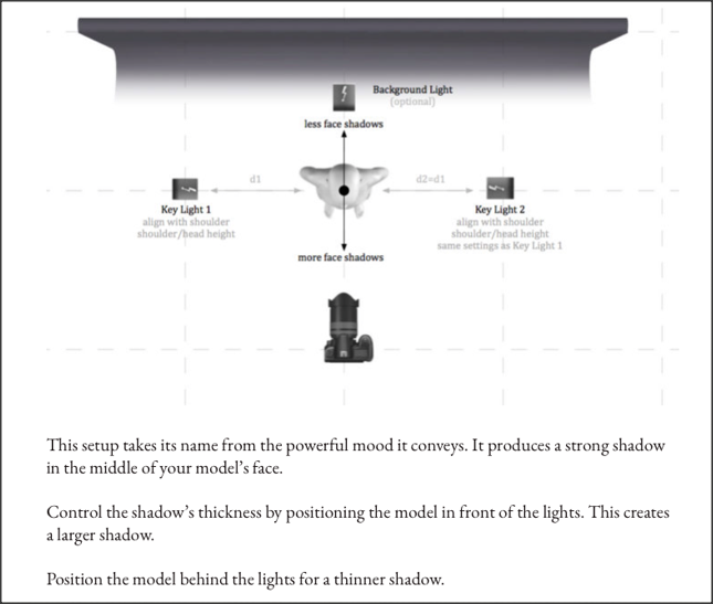
The lighting set up that I will use for my model
|

|
In my photo shoot to be successful this is the equipment that I will need and my camera
I will have to tell my model the angle to sit and where to stand this may take up to 2 ore 3 lesson and some time after school
the model I will be .
I will have to tell my model the angle to sit and where to stand this may take up to 2 ore 3 lesson and some time after school
the model I will be .
Shoot one


worst
this is my worst because it is over exposed and the image is blared
|
best
this is my best because the cd reflected really well and looks reel smooth
|
Editing of my photos


final out come
Shoot two
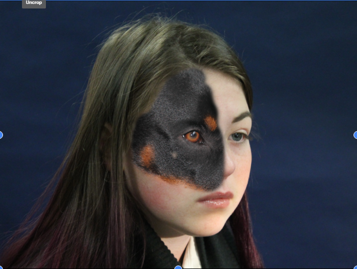
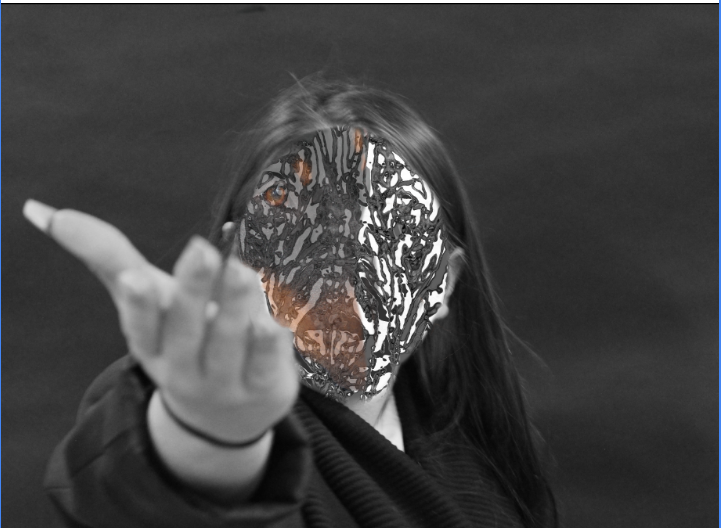
I have decided to use a persons face rather than a mask to extend my outcomes


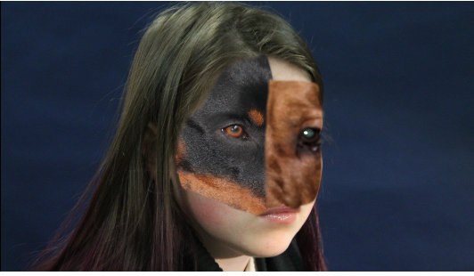
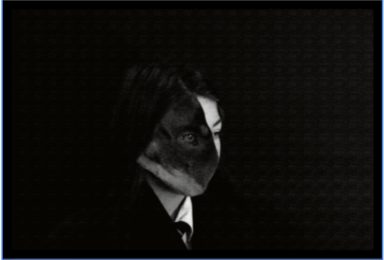
Mood board to show how I am going to use animal texture as a mask over the models face


Editing of my photos
Work done on Photoshop to develop my ideas
Edit 1


Edit 2


Edit 3


edit 4 |
|


Final gallery


Evaluation
The project theme was portrait to begin with I researched photographers that used different types of portraits to help me gain inspiration. I then did some further research and decided to start by using masks that I had created for my model to wear . I did this as I felt I wanted to hide the models face and not create the original portrait style photograph, as when I think of portraits I see a perfect image of a person. This was something I knew I did not want to have as my final piece.
During the project the part I enjoyed the most was developing my skill on photo shop by manipulating my outcomes. In photo shop I learnt how to use layers the quick selection tool and different filters. But most of all I enjoyed taking photographs of my model and learning how to use lighting and creating the correct back drops that suit my model and helped me when using photo shop .
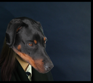
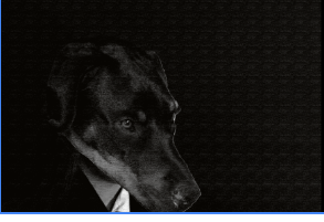
One new technique that I have learnt is to use the opacity tool by making it go transparent as this helped me when I was lining up two layers . This tool was used to create the images of the dogs face on my models face. Another technique I really enjoyed using was selection tool as this tool can be used to delete sections that I did not need. When using this tool I discovered that I need to use a contrasting colour that does not match the model or item that I have photographed as this makes it so much easier when manipulating on photo shop as this tool high light the area by colour selection.
On my next project I would like to challenge my self to find new ways to manipulate my work on Photoshop. I will do this by watching tutorials and experimenting on Photoshop. I would really like to be able to create images that are unrealistic depending on the theme I am given next. I will also like to explore different locations as the photographs that I have taken this project were studio set ups inside. Even though I did take the images of my dogs at home which was a different location. I felt the face was the main focus I wanted to capture therefore I did not think of backgrounds.
I feel that for my next project I will need to take more photographs and keep myself motivated as I felt I struggled to find ways to push my outcomes and shoots. This may be due to the photographers that I looked at at the start of the project as I felt I could not connect with the theme portraits as it became boring and dull.
I feel that the most successful part of the project was my second shoot as I was able to capture the model as well as I wanted and I learnt alot about lighting.
The main problem I encountered with this project was getting the right props for what I wanted to do this then had an impact on my ability to enjoy the theme as I felt I was limited by what I could achieve making the project not enjoy able.
I have learnt that I need to be more independent and organised in my work. I also need to take more images and collect the props I need before my shoots. I also need to think of what I can really achieve with what I have around me and how I can apply and use the equipment to the best of my ability.
If I was able to do the project again I would use plants instead of animals on the faces as I feel this would have created a better effect. I would of been able to take photographs outside and combined the image together to give a better final outcome.
During the project the part I enjoyed the most was developing my skill on photo shop by manipulating my outcomes. In photo shop I learnt how to use layers the quick selection tool and different filters. But most of all I enjoyed taking photographs of my model and learning how to use lighting and creating the correct back drops that suit my model and helped me when using photo shop .
One new technique that I have learnt is to use the opacity tool by making it go transparent as this helped me when I was lining up two layers . This tool was used to create the images of the dogs face on my models face. Another technique I really enjoyed using was selection tool as this tool can be used to delete sections that I did not need. When using this tool I discovered that I need to use a contrasting colour that does not match the model or item that I have photographed as this makes it so much easier when manipulating on photo shop as this tool high light the area by colour selection.
On my next project I would like to challenge my self to find new ways to manipulate my work on Photoshop. I will do this by watching tutorials and experimenting on Photoshop. I would really like to be able to create images that are unrealistic depending on the theme I am given next. I will also like to explore different locations as the photographs that I have taken this project were studio set ups inside. Even though I did take the images of my dogs at home which was a different location. I felt the face was the main focus I wanted to capture therefore I did not think of backgrounds.
I feel that for my next project I will need to take more photographs and keep myself motivated as I felt I struggled to find ways to push my outcomes and shoots. This may be due to the photographers that I looked at at the start of the project as I felt I could not connect with the theme portraits as it became boring and dull.
I feel that the most successful part of the project was my second shoot as I was able to capture the model as well as I wanted and I learnt alot about lighting.
The main problem I encountered with this project was getting the right props for what I wanted to do this then had an impact on my ability to enjoy the theme as I felt I was limited by what I could achieve making the project not enjoy able.
I have learnt that I need to be more independent and organised in my work. I also need to take more images and collect the props I need before my shoots. I also need to think of what I can really achieve with what I have around me and how I can apply and use the equipment to the best of my ability.
If I was able to do the project again I would use plants instead of animals on the faces as I feel this would have created a better effect. I would of been able to take photographs outside and combined the image together to give a better final outcome.
